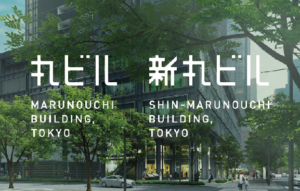


Logo design - Marunouchi Bldg. / Shin-Marunouchi Bldg.
People already has an image of “a special place as an office” toward both the Marunouchi Building and Shin-Marunouchi Building. We believe that the buildings, as the premium brand with a future, should send people a new message to appeal as “an extremely exciting place that you can reach at any time in your daily life no matter if on weekdays and weekends” on top of the existing image.We renewed the logo design of commercial department on a viewpoint from the rebranding perspective, with the goal of making the building's premium brand message clearer and simpler, and get it adapted to the demands of the times as as well as fitted with the sensibilities of visitors more precisely.
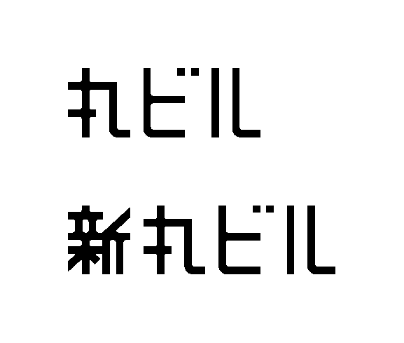
The key points of the concept are :
-Easily recognized and remembered by anyone
-Humorous and distinctive
-Linked to both tradition and novelty
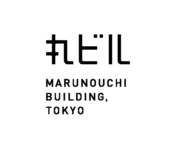
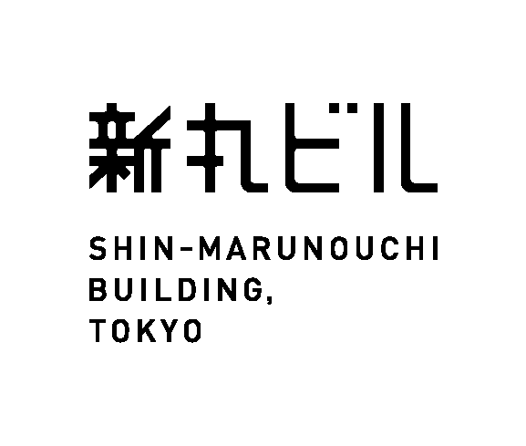
The nickname logo was newly created based on the forms of the Japanese letter of "Marunouchi Building" and "Shin-Marunouchi Building".
Data
Category : Logo DesignClient : MITSUBISHI ESTATE CO., LTD.
Completion : 2022
Producer:TOBA Soichiro
Special Collaborator:
KOITABASHI Motoki [ Logo Design / akaoni ]
TPOD Collaborator:
YASHIMA Toshiaki [ Fitting Design / Yashima Design Office ]